
Color is more than just a visual experience; it’s a powerful communication tool that can influence emotions, behaviors, and decisions. Understanding color psychology is crucial for designers who want to create impactful and effective designs that resonate with their target audience.
Understanding Color Psychology
The Science Behind Color Perception
Color perception begins in our eyes and is processed by our brain, triggering both psychological and physiological responses. The human eye can distinguish approximately 10 million different colors, each capable of eliciting specific emotional and behavioral responses. This remarkable ability has evolved over millions of years, making color recognition an integral part of human survival and communication.
Historical Context of Color in Design
Throughout history, colors have carried deep symbolic meanings. From ancient Egyptian art to medieval manuscripts, colors have been used to convey status, emotion, and spiritual significance. This historical foundation continues to influence modern design practices, though our understanding has become more nuanced through scientific research and cultural evolution.
The Fundamental Elements of Color
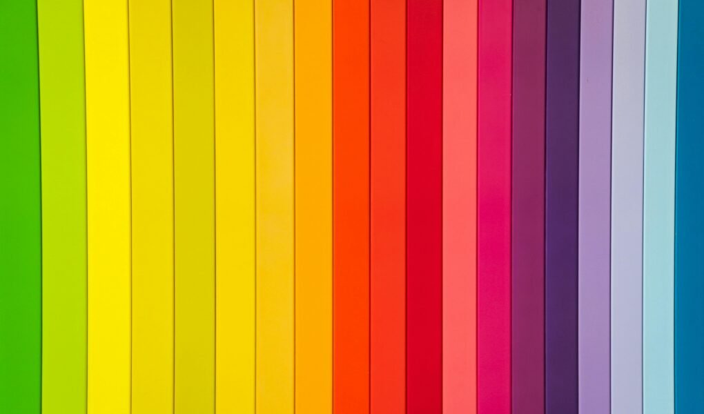
Color Wheel Basics
The color wheel serves as the fundamental tool for understanding color relationships. First developed by Sir Isaac Newton in 1666, the color wheel remains an essential reference for designers. It illustrates the relationships between primary, secondary, and tertiary colors, helping designers create harmonious color combinations.
Primary, Secondary, and Tertiary Colors
Primary colors (red, blue, and yellow) form the foundation of all other colors. Secondary colors (green, orange, and purple) are created by mixing primary colors. Tertiary colors emerge from combining primary and secondary colors, creating sophisticated hues that add depth and complexity to design work.
Color Harmony and Relationships
Color harmony is achieved through the strategic use of color relationships. Understanding concepts like complementary colors, analogous colors, and split-complementary schemes allows designers to create visually pleasing and emotionally impactful designs.
Psychological Impact of Individual Colors
Warm Colors and Their Effects
Warm colors, including red, orange, and yellow, tend to evoke feelings of:
- Energy and excitement
- Passion and love
- Optimism and joy
- Warmth and comfort
These colors are often used to create engaging, energetic designs that grab attention and stimulate action.
Cool Colors and Their Influence
Cool colors like blue, green, and purple typically generate feelings of:
- Calmness and serenity
- Trust and professionalism
- Growth and harmony
- Creativity and wisdom
These colors are particularly effective in designs requiring a sense of stability and trustworthiness.
Neutral Colors in Design
Neutral colors, including beige, gray, and brown, provide:
- Balance and sophistication
- Timelessness and versatility
- Foundation for other colors
- Professional credibility
Black and White Psychology
The use of black and white in design carries strong psychological implications:
- Black: Power, sophistication, mystery
- White: Purity, cleanliness, simplicity
Their contrast creates dramatic effects and enhances readability.
Color Psychology in Different Industries
Branding and Marketing
Colors play a crucial role in brand identity and marketing effectiveness. Research suggests that up to 85% of consumers cite color as the primary reason for purchasing a product. Successful brands carefully select colors that:
- Align with brand values
- Appeal to target demographics
- Stand out from competitors
- Create memorable associations
Web Design
In digital environments, colors influence user experience through:
- Navigation and hierarchy
- Call-to-action effectiveness
- User engagement levels
- Website credibility
- Loading time perception
Interior Design
Color choices in spaces affect:
- Mood and atmosphere
- Perceived temperature
- Spatial perception
- Functionality
- Occupant well-being
Product Design
Product color selection influences:
- Purchase decisions
- Perceived value
- User experience
- Market positioning
- Product longevity
Cultural Significance of Colors
Western Color Interpretations
Western cultures often associate:
- Red with love and danger
- Blue with trust and professionalism
- Green with nature and growth
- Purple with royalty and luxury
Eastern Color Meanings
Eastern cultures may interpret colors differently:
- Red symbolizes luck and prosperity
- White can represent death or mourning
- Yellow signifies imperial power
- Green may have religious significance
Cultural Considerations in Global Design
Global designers must consider:
- Local color preferences
- Religious significance
- Traditional associations
- Cultural taboos
Color Schemes and Emotional Response
Monochromatic Designs
Monochromatic schemes offer:
- Visual harmony
- Professional appearance
- Easy recognition
- Simplified decision-making
Complementary Color Combinations
Complementary colors create:
- Strong contrast
- Visual excitement
- Dynamic energy
- Memorable impressions
Analogous Color Schemes
Analogous color schemes provide:
- Natural harmony
- Comfortable viewing
- Subtle transitions
- Cohesive designs
Practical Applications
Choosing Colors for Different Audiences
Consider factors such as:
- Age groups
- Gender preferences
- Cultural background
- Industry standards
- Environmental context
Color Accessibility Considerations
Ensure designs are accessible by:
- Maintaining sufficient contrast
- Supporting color-blind users
- Providing alternative cues
- Testing across devices
Testing Color Effectiveness
Implement testing through:
- A/B testing
- User surveys
- Heat mapping
- Analytics tracking
- Focus groups
Common Color Mistakes
Oversaturation Issues
Avoid common pitfalls like:
- Too many colors
- Excessive brightness
- Clashing combinations
- Poor balance
Poor Contrast Choices
Watch out for:
- Low readability
- Strain on eyes
- Lost information
- Weak hierarchy
Future Trends in Color Design
Digital Color Trends
Emerging trends include:
- Dark mode optimization
- Variable color schemes
- Dynamic color adaptation
- AI-driven color selection
Sustainable Color Choices
Consider:
- Eco-friendly pigments
- Energy-efficient displays
- Sustainable materials
- Environmental impact
Conclusion
Understanding color psychology is essential for creating effective designs that communicate intended messages and evoke desired emotional responses. Success in color design requires balancing scientific knowledge, cultural awareness, and practical application while staying current with emerging trends and technologies.
FAQ Section
- How do colors affect conversion rates in web design?
Colors can significantly impact conversion rates, with studies showing that the right color choices can increase conversions by up to 24%. Success depends on alignment with brand identity, target audience preferences, and proper testing. - What colors should be avoided in global design?
Rather than avoiding specific colors, focus on understanding their cultural context. Research local meanings and test designs with target audiences to ensure appropriate color usage. - How does color psychology differ between digital and print design?
Digital colors use RGB and are affected by screen settings, while print colors use CMYK and are influenced by paper and ink quality. Both mediums require different approaches to achieve desired psychological effects. - Can color preferences be predicted by demographics?
While some general trends exist, individual color preferences are influenced by personal experiences, cultural background, and context. It’s best to conduct specific research for your target audience. - How often should brands update their color schemes?
Brand colors should evolve gradually based on market trends, audience preferences, and business strategy changes. Major color changes should be carefully considered as they can impact brand recognition and customer trust.